Black Window Frames and Mullions: Design Considerations

From Charlottesville to Richmond to Virginia Beach, we’ve loved seeing homes with bright white board-and-batten siding and black window frames and mullions. Fiber and cement based siding allows remodelers and home builders to add board and batten and even shake shingle siding to homes without the downside of using materials that don’t weather well.  Without the texture board and batten and shake shingles offer, the high contrast look of black frames and white siding can look a bit sterile.

One of the drawbacks to consider with black framed windows is that using window treatments can be tricky. So if you’re thinking about updating a home with black mullions and frames, consider whether or not you’re comfortable without window treatments. And if you absolutely can’t live without window treatments you might look at clean and simple roman shades.

DSC05676_BlackWindowsBlog.jpg

Another consideration is heat transfer. The black absorbs more heat which transfers into the home. So on a south or west facing window where I live in Richmond, Virginia, black can make a significant temperature difference in the summer.

If you’re considering adding black frames to a period home with earth tones like exposed brick you might want to paint an existing window black before you go all-in. Black windows and earth tones can be tricky. You might want to try to draw on some of the tones in the brick; maybe slate gray.


What do Monica Lewinsky, the Watergate and Mussolini have in common?

Bob Dole and Monica Lewinsky were next door neighbors at the Watergate during "Monica-Gate". I imagine Senator Dole speed walking, fiddling for his keys to avoid having to chit-chat with Monica in the hallway....."awkward"..... Like most people, I know more about the scandalous side of the Watergate than I do the complex itself. When we were editing our images for the Wall Street Journal piece we worked on about the Watergate and its residents, I looked at aerial photographs and realized the offices and apartments form a deconstructed Colosseum with poolside sunbathers at its center rather than gladiators and lions. I realized I knew nothing about the Watergate's architect Luigi Moretti or its development. 

View of the Watergate from the Kennedy Center. Photo: Alston Thompson Photography

When I discovered the architect was Italian, I figured I was on to something. Moretti is considered a Modernist. The Watergate was one of the first ever structures derived from a computer aided design. Moretti was heavily influenced by Brutalist architects, particularly Le Corbusier. While Brutalism in English equates to violent, oppressive behavior, in French it means wild, rough or unrefined. After World War II Corbusier wanted cheap, unfinished surfaces that reflected the state of urban reconstruction after the war. Reinforced concrete fit the bill. 

Architecture As Propaganda ........In some ways the selection of Moretti is as scandalous as its occupants. A fervent Fascist, he designed Mussolini's personal gymnasium and the fencing academy within the Foro Mussolini (now called the Foro Italico in an attempt to separate it from its Fascist past). The complex was home of the Fascist Academy of Physical Education. In 1938 Mussolini hosted Hitler at the academy with a performance by hardbodied young men carrying torches in the shape of a Swastika and the words "Heil Hitler". Hitler was so impressed he told Mussolini he had seen "the Roman state resurrected from remote tradition to new life." 

How Moretti, someone so closely associated with the Fascist leader, was able to pull off the Watergate design in the cradle of democracy is astonishing. Either the classical, curvilinear influence of the Colosseum obscured the developer's Fascist design roots or Moretti was one hell of a pitchman. It's hard to believe that Moretti didn't revel in planting a ten acre Modernist/Fascist flag in the heart of Fascism's ultimate foe. But whether that's the case or not isn't clear. There were practical considerations for it's curved structure in that it echoed the proposed Inner Loop Expressway and surprisingly the Kennedy Center next door (originally called the National Cultural Center). Edward Stone's initial design for the Kennedy Center was curvy and modern rather than the final rectangular classic revival design. So perhaps Moretti's design was more in keeping with Brutalism's aspiration for a structure to reflect the untamed nature of the urban concrete cityscape.

One problem that arose in the extensive approval process of the Watergate was its height. At the time there was a ninety foot limit for residential buildings. So to satisfy zoning laws, retail and office space were added to the design. So, no, apparently the communal design was not some subversive Fascist ploy, but rather a practical attempt to satisfy zoning laws.

And the theory this author put forth, that Moretti's design was some sort of Fascist Trojan Horse draped in neoclassical clothes can neither be proved nor disproved.  Yet it's hard to believe that Moretti didn't take some subversive pleasure in pulling off the Watergate complex.                                          

And, finally, below is the Wall Street Journal article we contributed to that led me down this rabbit hole:                                                                                                                                              

WATERGATE_COVER copy.jpg

Höweler + Yoon : Architecture as Interface

The Helms Design Center hosted Eric Höweler and Meejin Yoon for a reception, lecture, and discussion in collaboration with the Cal Poly LA Metro Program in Architecture and Urban Design.

h+y china brick building.jpg


Höweler + Yoon described submitting a design to a client in China that involved turning a packed, inverted pyramid space into an interpretation of the traditional Chinese house. All of the architects who submitted plans were rejected after their 1st iteration. The client insisted they channel "the Chinese feeling" and incorporate it into the design. The architects were given a Chinese poem to interpret as the building and they were taken to a mountaintop in Zhucheng Province for inspiration.


Through a packing exercise the Höweler + Yoon team developed a series of courtyards which framed a Chinese garden with living and work spaces nested closely together. After nine months the team was informed that not only had the program and site changed, but that construction was already underway. With a flurry of activity the team adapted its plans to fit the new site and its new use as a 60,000 square foot exhibition hall. Traditional Chinese bricks and small windows with flared surrounds made of Corten were used to stunning effect as the primary construction materials. Remarkably, one of the doors, described by Höweler as "an interlocking frame within a frame", was designed and fabricated in a week. This build highlighted how Höweler + Yoon adapt to last minute site changes and cultural idiosyncrasies, while underscoring the collaborative capabilities of the engineers and craftsmen they employ to fulfill their vision.


Höweler + Yoon’s masterful problem solving skills enable them to turn the very constraints imposed upon them into a creative force. The grey brick and the traditional Chinese masonry practice of a fixed east/west, north/south orientation applied to the exhibition hall, regardless of the geometry of the site, has been leveraged to mesmerizing effect. While right angles produce squared corners and smooth surfaces, oblique angles lend to the juxtaposition with a staggered, feathered, rough effect. With the masonry surface serving as a compass, Höweler + Yoon were able to delve further into the notion of architecture as user interface; as opposed to a place to be passively observed, maneuvered and inhabited.


Responding to a request for a residential high-rise, their team designed a staggered balcony for each apartment for privacy, and used an algorithmic packing logic where each floor was divided into ten equal parts, and the next floor eleven equal parts and so on.....An astonishing bowed, sculptural exterior effect materialized from the logic of the interior layout. While the design was not commissioned, the exercise gave Höweler + Yoon insight into how rules and relationships can affect outcomes of design; not unlike how rules are used in computer programming and scripting languages.


Höweler + Yoon have an acute interest in architecture as an information system. An outdoor sculpture project for the city of Boston enabled them to represent the twenty-one boroughs through data points in the city's 311 mobile reporting app. The sculpture tapped into the open source reporting system and broadcast the activity through a computer controlled lighting system. Another outdoor lighting project highlighted during the lecture was a project at the San Ysidro border between the U.S. and Mexico where they wanted to expand the number of entry lanes. Essentially a band of light spans the new twenty-six lane border crossing. As a car crosses the border a pulse of light is triggered, while multiple cars cause an ebb and flow of colliding pulses to spectacular effect. The practical effect was to give drivers a timeframe while waiting to cross the border.


Höweler + Yoon were commissioned to design the Sean Collier Memorial at M.I.T., commemorating the campus security officer who was killed during the manhunt for the Boston Marathon bombers. The recurring themes "M.I.T. Strong" and "Boston Strong" led the team to choose a dome of varying sized granite blocks to signify strength and unity from diversity. The blocks weigh multiple tons and support each other through pure geometry and physics. The lengths to which the team went to build a fully compressive, solid block granite structure were fittingly heroic for such a memorial. They developed an applet to calculate the gravity loads of the granite blocks to ensure they stayed within the extraordinarily tight two millimeter tolerance threshold.


Höweler + Yoon’s process stretches beyond defining public and private space or how architecture affects boundaries and frames viewpoints. Rather their work explores how architecture shapes interfaces between spaces and the people interacting within those spaces. Höweler + Yoon embrace the fluidity of spaces by looking beyond architecture as static; and see it as an interface much like software with inputs and outputs, datasets, and by balancing technical functions with visual elements.


The End of Sitting Down In Public Spaces?

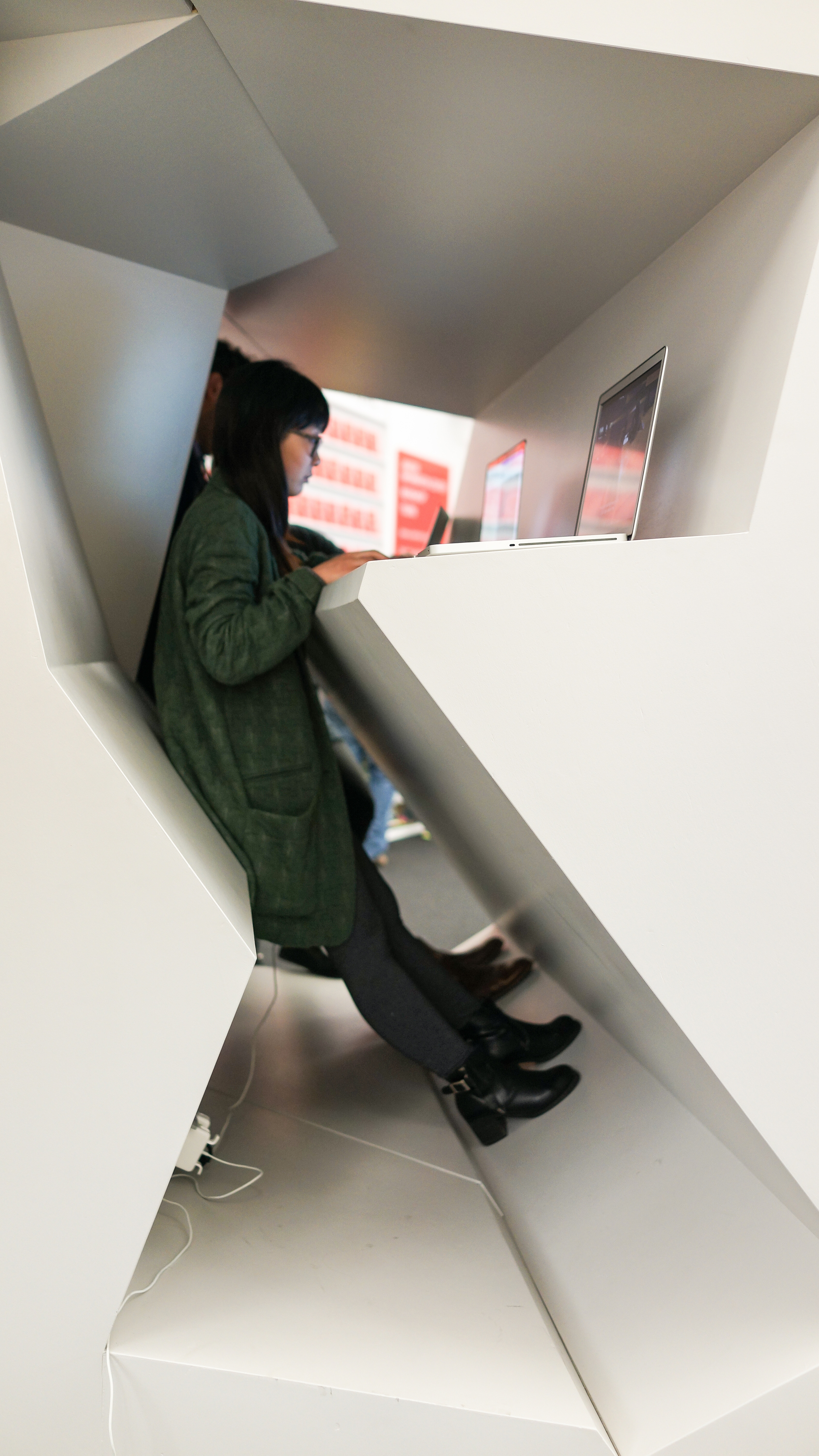
Sitting down can kill you? Well, maybe not....but as more medical evidence proves that a sedentary lifestyle and sitting for long periods can be as harmful as smoking, stand-up desks are becoming ubiquitous. The design team of RAAAF and visual artist Barbara Visser explore the future of resting positions in the workplace and public spaces of the future with their installation, The End of Sitting - Cut Out.

randolphsquareEndofSitting.jpg

The Living Room of Chicago

The mother-ship of the Chicago Architecture Biennial is the Chicago Cultural Center. At the entrance the design team of Pedro&Juana from Mexico City have created “Randolph Square” which gives a whimsical jolt of light from spherical fixtures; not unlike the old gas sconces that originally lit the space. The lights are conjoined by bright orange rope and a pulley system which is counterbalanced by solid brass weights. Having undergone many transformations since its construction in 1897 as the public library, the choice of a moving light system is brilliant. Visitors are encouraged to pull on the weights and ropes, which gives the space fluidity and a visceral experience for visitors. 

The white, metal mesh furniture, some of which is on rockers, enhances the feeling of lightness and movement of the space. Having designed such an interactive lighting system draws visitors into what was conceived as the “living room of the city”.

The State of the Art of David Adjaye

Alongside the Chicago Architecture Biennial, the Art Institute of Chicago showcased forty-nine year old David Adjaye’s mid-career body of work which includes fifty built projects. Having such a comprehensive look at an architect so young gives the exhibit a vitality and sense of possibility not often found in an architectural retrospective of this scope. Adjaye’s aesthetic is grounded in context. Adjaye strives to convey a sense of place with his designs; rather than showcasing a specific design style. Born in Tanzania to Ghanaian parents, and raised in the Middle East and England; Adjaye’s sensibilities are anything but parochial. As Adjaye’s pavilions and public places are accessible to the people in the surrounding community, so are the ideas behind their design. Rather than imposing an idea on a community through radical design, Adjaye’s designs are emblematic of the surrounding communities which lends context to his modern vision. His designs seek to bridge differences between people in communities struggling with cultural differences. Being the son of a diplomat, having lived in diverse cultures, Adjaye has clearly honed a mastery for reflecting the essence of a community with a welcoming, uplifting, modern aesthetic.  


In addition to models, sketches, floor plans and film clips; his 2007 wood-slat “Horizon” pavilion has been moved and reassembled on the 2nd floor of the Abbott Galleries in the modern section of the Art Institute of Chicago. If you are planning to attend the State of the Art of Architecture: Chicago Architecture Biennial, then you should take the time to experience this wonderful showcase of David Adjaye’s work.

SarahAdjaye.JPG

Sarah Thompson inside Adjaye's "Horizon" pavilion.

We are headed to the Chicago Architecture Biennial

We are so excited to be heading to the inaugural Chicago Architecture Biennial. We'll be arriving October 2nd. The official kick-off is on October 3rd. The first event we'll be attending is an interpretive performance of Powers of Ten; a Charles and Ray Eames film commissioned by IBM in 1977. The performance, Superpowers of Ten is an interpretation presented by the Madrid-based architect Andres Jaque and his Office for Political Innovation. The Eames' produced almost sixty books, films and performances highlighting the aesthetic elegance of scientific principles for clients such as: Polaroid, Westinghouse, Boeing and IBM. These principals were central to their design vision. They sought to breakdown complex scientific concepts into simple visual elements for the layman. 

The next event we have on our itinerary is a panel discussion: Post Modern Architecture: Preservation's New Frontier. This discussion will highlight the post-1970 architecture of Chicago as a case study. It will explore the evolution of concepts related to major projects from this period; while exploring conceptual issues about the interpretation of history through urban architecture. Panelists include: Cynthia Weese of Weese Langley Weese and  Zurich Esposito, Executive Vice President of A.I.A. Chicago. The discussion will be moderated by Paul Makovsky of Metropolis Magazine.

We've also got a couple of social events planned, a 125th anniversary tour of the University of Chicago and a tour of the Frank Lloyd Wright designed  S.C. Johnson headquarters.

We hope to see you there.....